All projects

Goldenvoice: Two Festivals, One Design Vision

Led design direction across Goldenvoice's festival portfolio, building design systems and digital experiences for Coachella and Stagecoach that served millions of mobile-first festivalgoers.

Year
2021 - 2024
Client
Goldenvoice
Category
Digital Design, Design Systems, UX, Branding
Duration
3+ years
Coachella festival grounds at golden hour with balloon chains floating against a turquoise sky

Two festivals, shared DNA, different audiences

Goldenvoice runs both Coachella and Stagecoach out of the same venue in Indio, California. While they share infrastructure and an audience that often overlaps, the brands are distinct: Coachella is global, genre-fluid, and visually expansive. Stagecoach is country, community-driven, and unapologetically fun.

Both sites needed to serve the same lifecycle: presale hype, lineup announcements, ticket sales, and live festival weekends. Each phase had different content priorities and user intents. The existing sites treated every phase the same and neither had a design system that could flex across the full season.

The goal: build design systems and digital experiences for both festivals that could adapt across the full lifecycle without requiring a redesign at each phase.

4
Content phases
2
Festival brands
80%+
Mobile traffic
43+
Pages consolidated

Design direction and systems thinking

I led digital design across both festivals. For Coachella, that meant owning the visual direction, building the design system from scratch, and designing key pages across mobile and desktop. For Stagecoach, I directed the brand revitalization, rebuilt the information architecture from the ground up, and established the "Disco Cowboy" creative direction that carried through to physical activations.

Across both properties, the core of the work was systems thinking: building token-based palettes, flexible typography scales, and component libraries that could support wildly different content states without breaking. Every decision about a gradient, an icon, or a navigation pattern needed to hold up across the full lifecycle of each festival.

Understanding the audience and the content

Step 01
Competitive analysis
Audited competitor festival sites to identify patterns in navigation, ticket funnels, and content hierarchy. Mapped where both Coachella and Stagecoach fell short on self-service and wayfinding compared to peers.
Step 02
Tree testing and card sorting
Ran tree tests via Maze to validate proposed navigation structures. Card sorting exercises revealed how users mentally grouped festival content, which directly informed information architecture changes. For Stagecoach, this was critical: the original site had 43+ separate pages linked from the homepage with duplicated and overlapping content.
Step 03
Information architecture overhaul
Consolidated pages into logical categories, reducing redundancy across both sites. Validated groupings through anonymous user card-sorting tests and confirmed improvements through Google Analytics behavior flow analysis.
Step 04
Mobile-first content strategy
With over 80% of traffic on mobile, every layout decision started at the smallest viewport. Dynamic homepage heroes were designed to surface the most relevant content for each phase: lineup teasers during presale, ticket CTAs during sales, and live updates during festival weekends.
Stagecoach site content map showing the full menu structure across Music, Passes, Experiences, Plan, Festival Info, and Footer sections
Stagecoach content map: mapping 43+ existing pages across six primary navigation categories
Side-by-side comparison of old vs. new vs. alternative navigation structures for the Plan section
IA consolidation: comparing old, proposed, and alternative structures for the Plan section

"Sky Meets Grass"

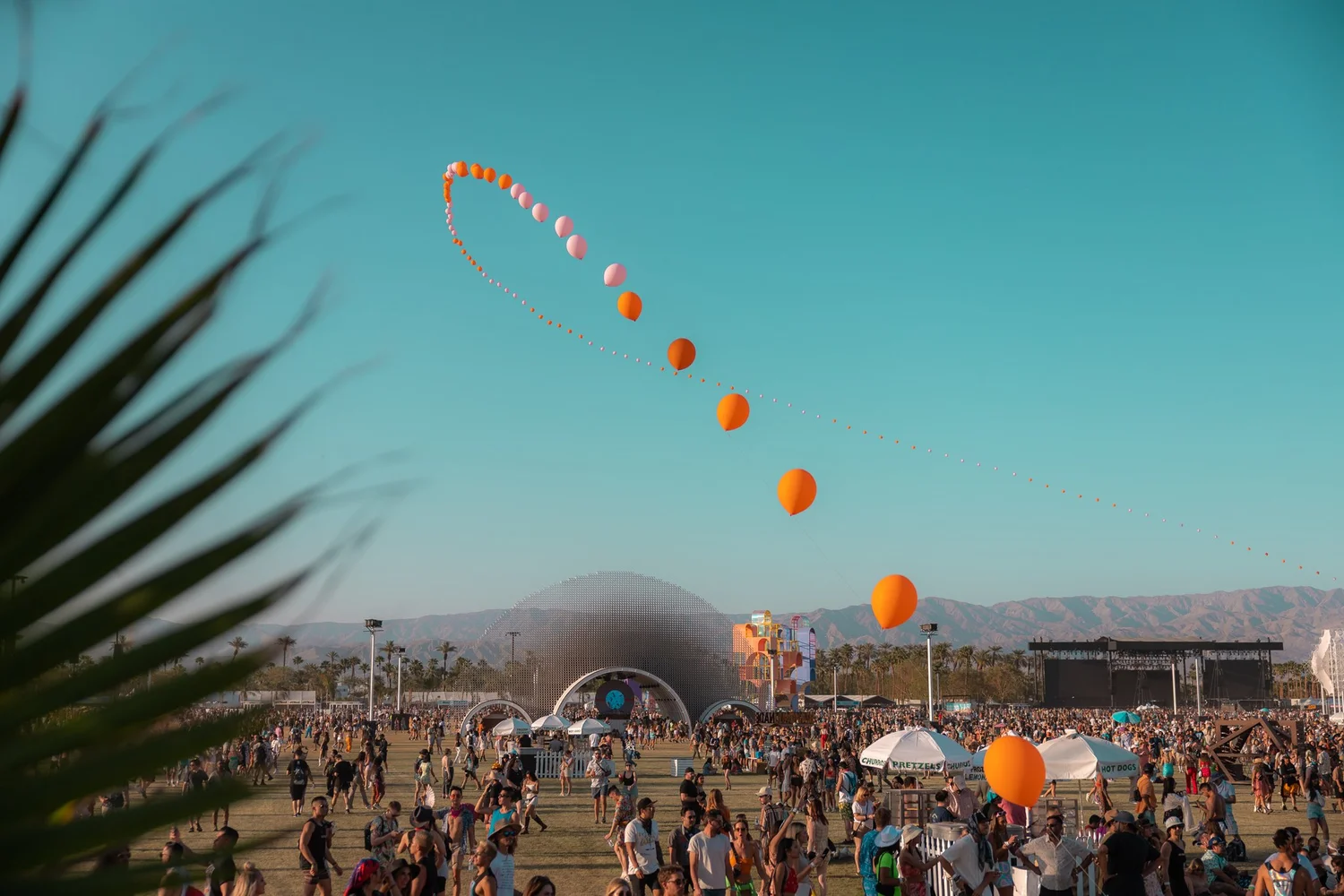
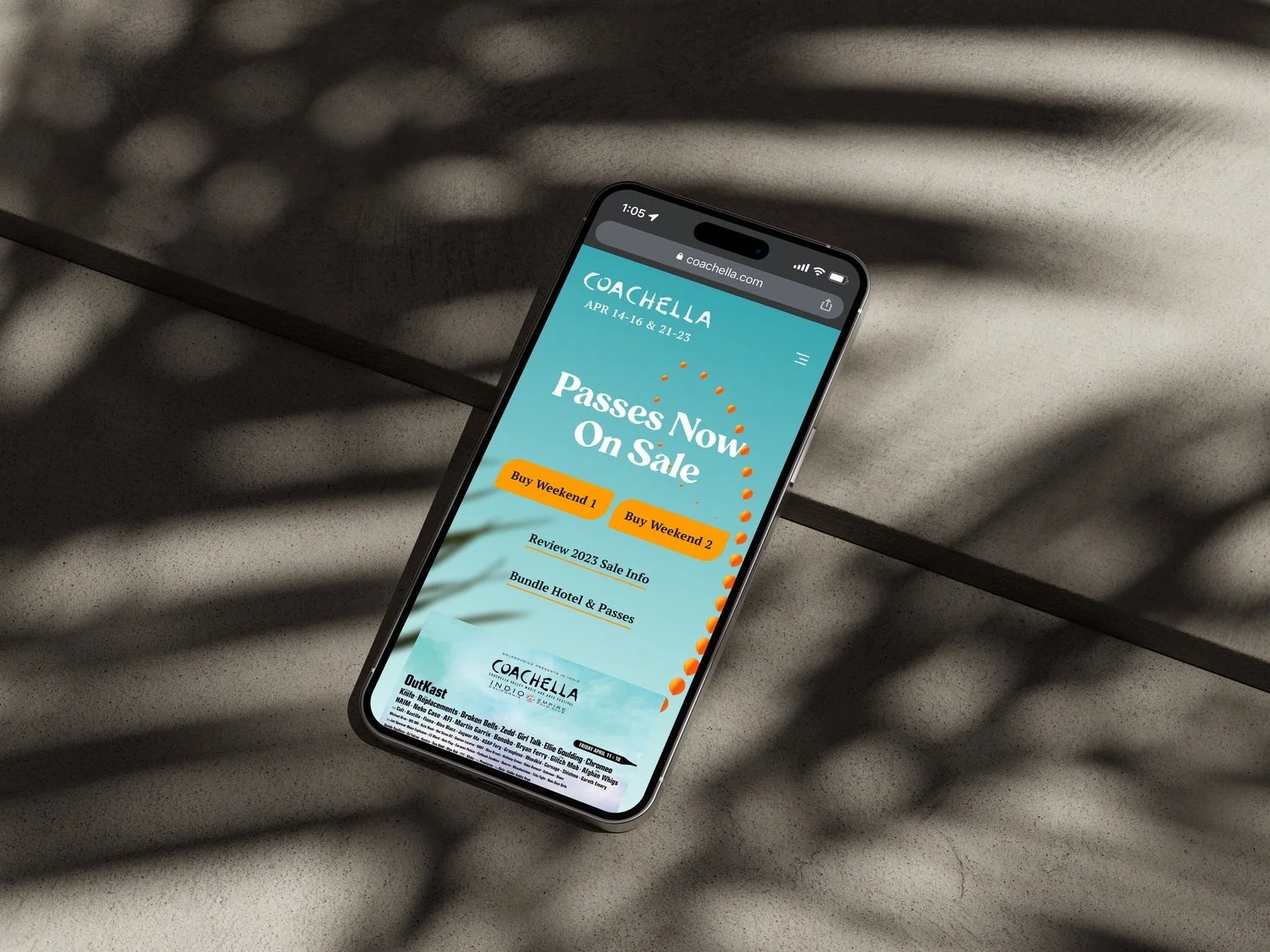
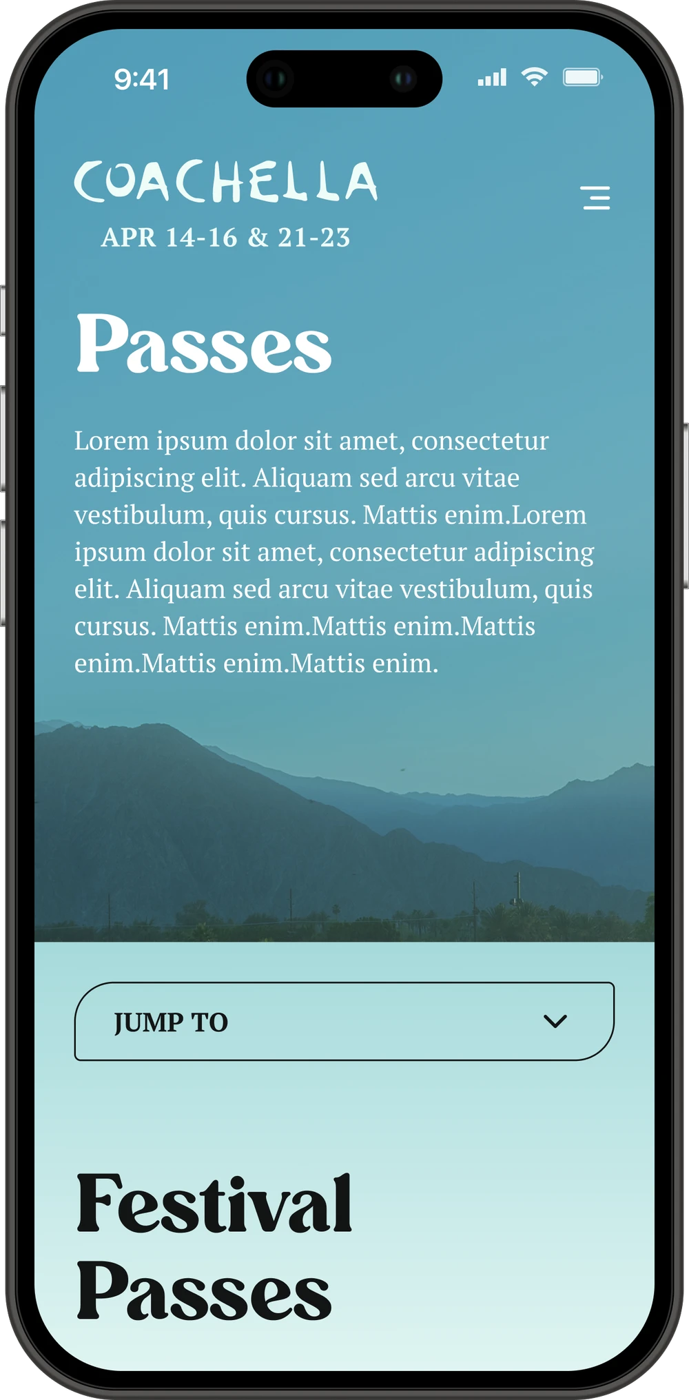
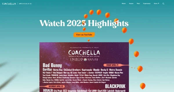
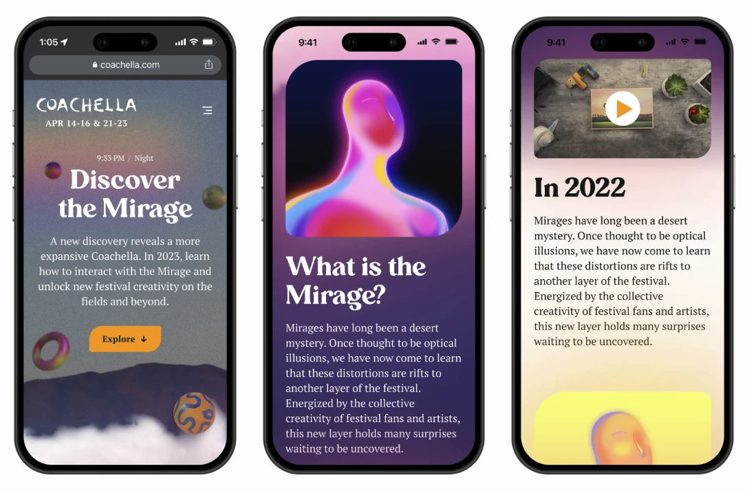
The Coachella design system was built around a single idea: the feeling of laying in the grass at golden hour and looking up at the sky. That moment became the organizing metaphor for every visual decision. The gradient palette transitions from warm desert greens through ocean blues to open sky. Buttons reference the floating balloon chains that arc across the festival grounds. Typography flows between structured navigation type and expressive editorial headlines.

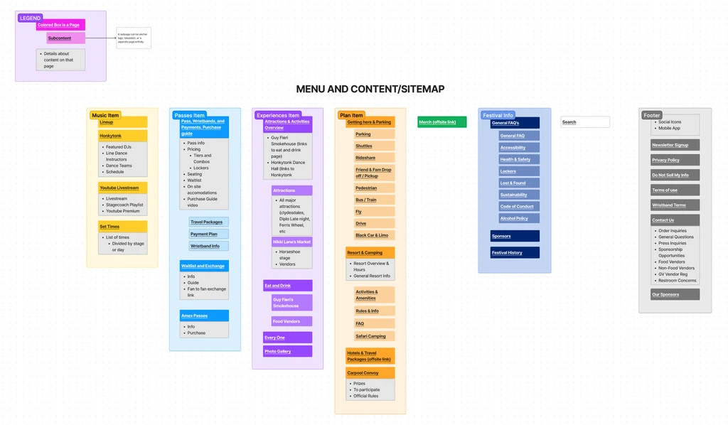
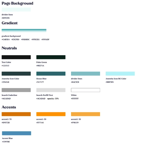
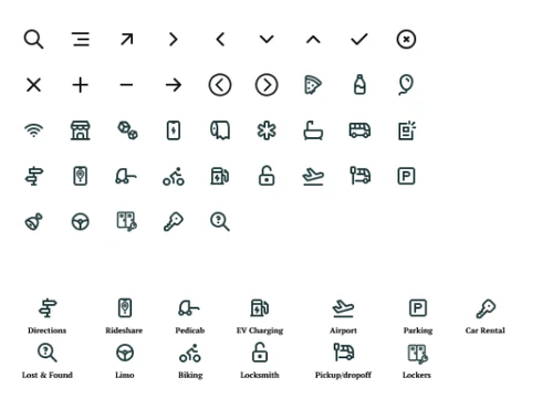
The system shipped as a token-based palette with named color roles (backgrounds, gradients, neutrals, accents), a custom icon set for festival amenities and wayfinding, and a component library that scaled across four distinct content phases without visual drift.

Moodboard collage with retro festival photography, bold serif typography, and warm earthy tones
Visual moodboard: retro warmth, serif typography, and festival energy informed the design direction
Coachella design system: typography specimens and color block compositions
Typography and color compositions: headline styles, app store lockups, and the full alphabet in the brand serif
Color palette specification showing backgrounds, gradients, neutrals, and accent tokens
Custom icon set for navigation and festival amenities including rideshare, EV charging, and wayfinding
Left: Token-based color palette with named roles. Right: Custom icon set for navigation and festival amenities

Key screens

iPhone showing Coachella homepage with Passes Now On Sale hero, weekend CTAs, and palm frond shadows
Mobile homepage during ticket sales: dynamic hero with weekend-specific CTAs and the Sky Meets Grass gradient
Mobile Passes page with balloon chain animation, gradient sky background, and jump-to navigation
Passes page: balloon animation on load with jump-to navigation
Desktop view showing Watch 2025 Highlights video section and lineup announcement
Desktop experience: video highlights and lineup reveal
Three iPhone mockups showing The Mirage feature: discovery page, AR content, and day-night cycle
The Mirage: an immersive AR and Web3 experience with a dynamic day/night cycle that adjusted to the visitor's local time

"Disco Cowboy"

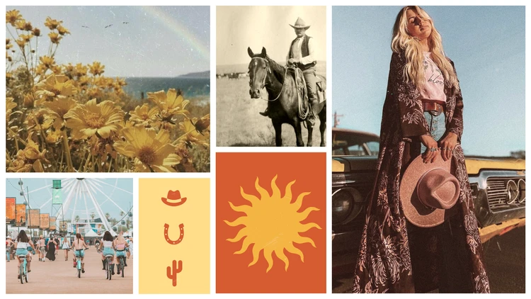
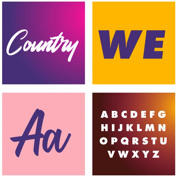
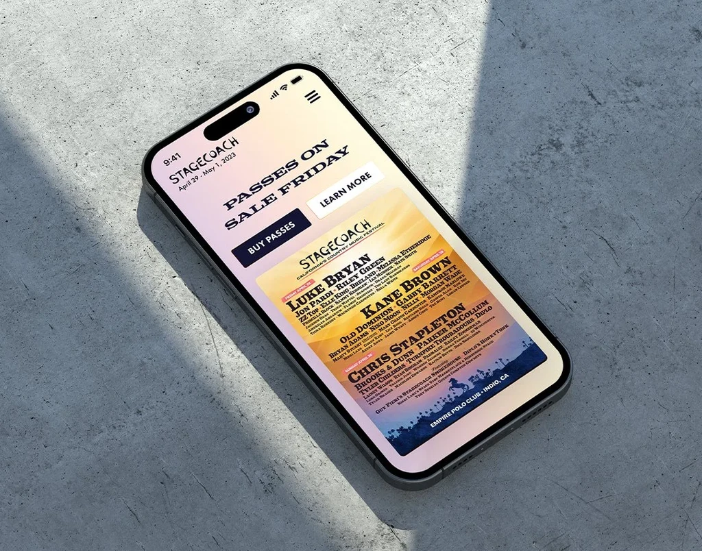
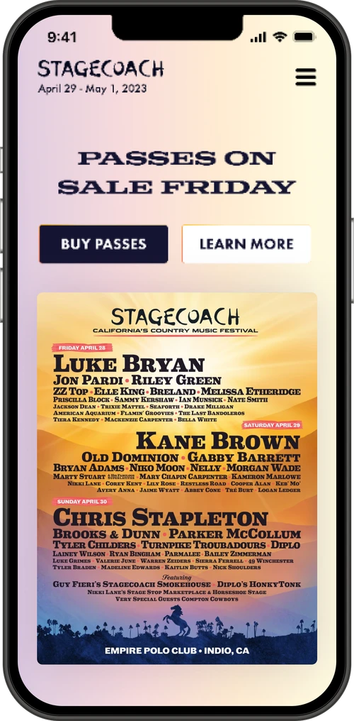
Stagecoach's existing site had wood texture backgrounds, old leather, and typography that didn't match the energy of the festival. The creative direction needed to feel fun and energetic but grounded without looking dated.

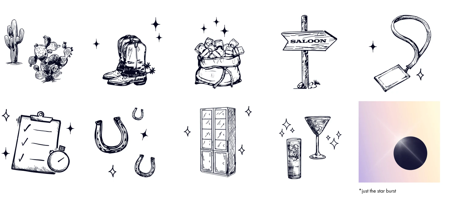
The answer was "Disco Cowboy": Coachella Valley sunset colors against cowfolk silhouettes, neon and vibrant contrasting colors evoking bar signage and 80s disco energy. The brand guide adapted colors and styles based on visitor experience timing (morning, noon, golden hour) and served as the reference for the 2023 festival branding across physical activations.

Stagecoach moodboard with sunflowers, cowboy on horseback, festival cyclists, and warm desert tones
Moodboard: grounded warmth, desert tones, and festival community energy
Disco cowboy moodboard with neon pink cowgirl, disco ball boots, and festival crowd throwing hats
Moodboard: the disco cowboy direction, neon energy meets country authenticity
Stagecoach color palette: dark purple through violet, pink, gold, light blue, and white
Color palette: sunset-to-dusk gradient anchored by deep purple and warm gold
Typography specimens showing script and bold sans-serif styles in magenta, gold, and pink
Hand-drawn illustration set: cactus, cowboy boots, horseshoe, saloon sign, drinks, and lockers
Left: Typography system pairing expressive script with bold display sans. Right: Custom hand-drawn illustration set for navigation and wayfinding

Key screens

iPhone on concrete showing Stagecoach mobile homepage with passes on sale hero and lineup poster
Mobile homepage: passes on sale with lineup poster and sunset gradient hero
Mobile lineup page with headliners Luke Bryan, Kane Brown, and Chris Stapleton
Mobile Resort and Camping page with glamping tent and inclusivity statement
Mobile search overlay with hand-drawn cowboy illustration and sunset gradient
Left: Full lineup with day-by-day headliners. Center: Resort and camping with the brand illustration style. Right: Search overlay featuring custom cowboy illustration

Decisions that scaled across both festivals

01
Phase-adaptive content system
Both sites needed to serve presale, sales, lineup, and live festival states. Rather than redesigning for each phase, the design systems used flexible hero components and modular content blocks that swapped based on the current phase. One system per festival, four experiences each.
02
Token-based color architecture
Colors were defined as semantic tokens (background, gradient, neutral, accent) rather than raw hex values. This meant entire palettes could shift for special events, time-of-day theming, or seasonal updates without touching individual components.
03
Balloon-chain animations via Lottie
Coachella's signature floating balloon animations on the Passes page were implemented as Lottie files rather than CSS or GIF. This kept file sizes minimal while maintaining the fluid, physics-based motion that made the page feel alive.
04
Dynamic day/night theming
Coachella's Mirage feature detected the visitor's local time and adjusted the entire color scheme. Stagecoach adapted its brand palette to morning, noon, and golden hour states. Both tied the digital experience to the physical one.
05
Analytics-driven navigation
Nav items were reorganized based on actual traffic data rather than stakeholder assumptions. High-traffic paths like ticket purchasing and lineup browsing were elevated; low-usage items were consolidated into contextual menus. User card-sorting validated the new structures before launch.
06
Brand guide as physical activation spec
The Stagecoach brand guide wasn't just for digital. It served as the reference for 2023 festival branding across physical activations, signage, and merchandise, bridging the gap between the screen and the grounds.

Two brands, one design infrastructure

The design systems built for Coachella and Stagecoach gave Goldenvoice a repeatable creative infrastructure that scaled across both festivals without sacrificing the distinct identity of each brand. Phase-adaptive content meant both sites served four distinct experiences (presale, sales, lineup, live) from a single system per festival.

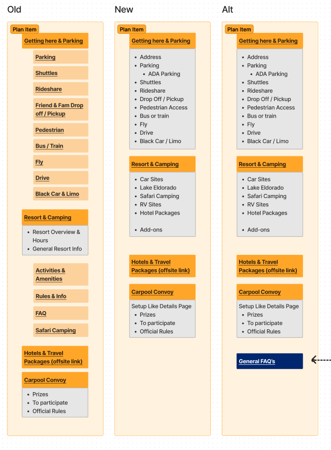
The Stagecoach brand guide extended beyond digital into physical activations, signage, and merchandise for the 2023 festival. Analytics-driven navigation restructuring, validated by user card sorts, ensured high-traffic paths like ticket purchasing and lineup browsing were immediately accessible. The token-based color architecture made seasonal and event-specific updates a configuration change instead of a redesign.

2
Festival brands unified
4
Phase states per site
Digital + Physical
Brand guide scope
Data-driven
Navigation restructure
Next project
Simplot