All projects

Johnson & Johnson: PSC Command Center

Designed a data-driven command center for J&J's Patient Services Center, giving five distinct personas role-specific dashboards to monitor product launches, track KPIs, and surface operational issues in real time.

Year
2023
Client
Johnson & Johnson
Category
UX Strategy, UI Design, Data Viz
Duration
IBM Consulting
Johnson & Johnson PSC Command Center hero — headset on laptop with Program Vision overlay

Five roles, one platform, zero visibility

Johnson & Johnson's Patient Services Center (PSC) supports the full patient lifecycle for pharmaceutical products, from benefits investigation through ongoing therapy management. The teams running these operations had no unified tool to monitor performance across products, identify bottlenecks, or act on anomalies before they became problems.

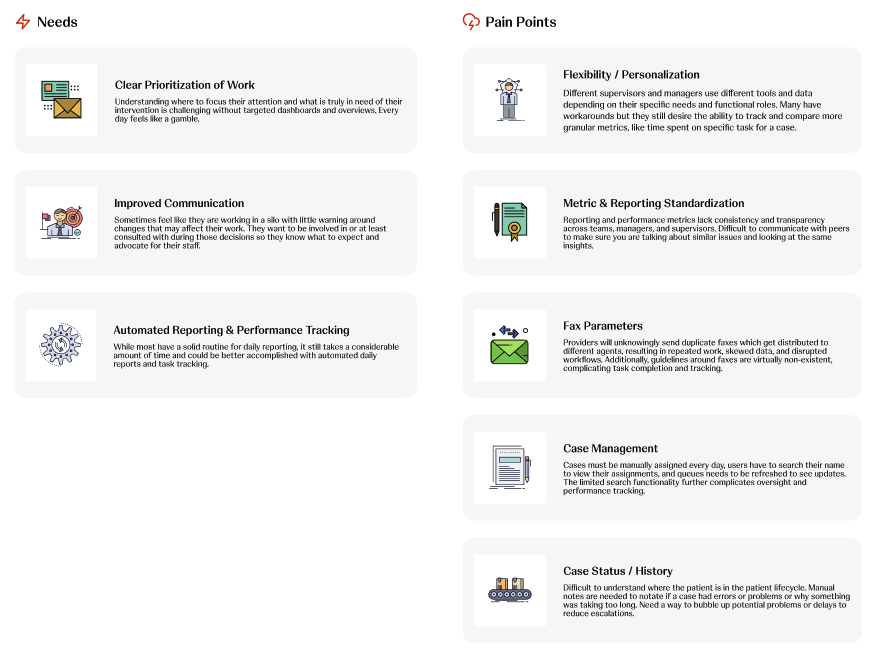
Data lived in disconnected systems. A Business Partner tracking product launch health had no line of sight into the same metrics a VP needed for executive reporting. Supervisors managing frontline teams couldn't see staffing trends alongside case volume. Everyone was working from different spreadsheets, at different cadences, with different definitions of "on track."

The vision: create a Command Center that empowers associates, field personnel, and leadership with the data and insights they need to ensure performance, quality, and the best possible patient experience.

Figma
View the Golden Thread →
Full persona journey maps in Figma
5
User personas
4
Research phases
20+
Pain points tracked
1
Unified platform

Research through high-fidelity design

I led UX strategy and UI design for this engagement through IBM Consulting. My work spanned the full arc: facilitating stakeholder interviews, synthesizing research findings into personas and journey maps, defining the information architecture for a role-based dashboard system, and delivering production-ready designs.

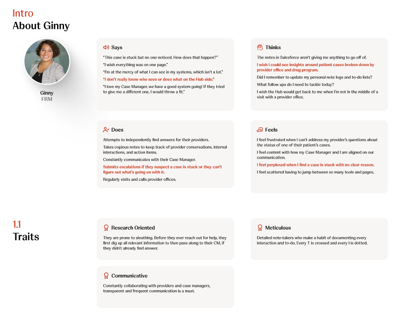
The project followed a structured research methodology across four phases: stakeholder interviews, synthesis and pain point tracking, golden thread journey mapping, and preliminary architecture definition. Each phase built directly on the previous one, so the final dashboard designs were grounded in real user needs rather than assumptions about what each role wanted to see.

Four phases from interviews to architecture

Phase 01
Stakeholder interviews and pain point discovery
Conducted interviews across all five persona groups to identify pain points and opportunities with existing tools and processes. These conversations surfaced the core tensions: Business Partners needed product-level detail, VPs needed portfolio-level rollups, and Supervisors needed real-time operational views. All from the same underlying data.
Phase 02
Synthesis and pain point tracking
Synthesized interview findings into a structured Pain Point Tracker organized by persona. Four top themes emerged: reporting limitations, lack of proactive planning capabilities, manual processes that pull from production time, and limited visibility into the patient journey at an aggregate level. These themes drove every subsequent design decision.
Phase 03
Golden Thread journey mapping
For each persona, I mapped a "Golden Thread," a step-by-step narrative of how they would interact with the Command Center through a realistic scenario. Justin the Business Partner notices a benefits investigation anomaly. Jill the VP gets an urgent alert about SLA compliance. Each journey validated which dashboard modules, data points, and actions that persona actually needed.
Phase 04
Preliminary architecture and dashboard design
Translated research into a modular dashboard architecture. Each persona gets a tailored view with role-appropriate modules: AI-powered product analysis, product launch monitors, team performance KPIs, staffing charts, and a PSC Performance Overview with an efficiency score. The system is highly modular so personas have varying degrees of allowed customization.
Research synthesis: user needs including clear prioritization, improved communication, and automated reporting mapped against pain points including flexibility, metric standardization, fax parameters, case management, and case status tracking
Needs and pain points synthesized from stakeholder interviews across all five persona groups

Five roles, five tailored experiences

Each persona represents a real role within J&J's Patient Services Center. Their dashboards share a common design language and component library, but the modules, data density, and available actions differ based on what each role needs to accomplish day to day.

Justin
Justin
Business Partner
Jill
Jill
VP / Director
Alicia
Alicia
Manager / Supervisor
Melissa
Melissa
Lead / Associate
Ginny
Ginny
FRM
Empathy map for Ginny (FRM): Says, Thinks, Does, Feels quadrants with personality traits including Research Oriented, Meticulous, and Communicative
Empathy map for Ginny (FRM): Says/Thinks/Does/Feels mapped from interview data, with red highlights marking key pain points

The Command Center dashboard

VP dashboard with AI Analysis of Product Launch, Team Performance KPIs, Staffing charts, Product Launch Monitor, and PSC Performance Overview at 85% efficiency
VP / Business Partner view: AI-powered product analysis, launch monitor with trend data, team KPIs, and PSC Performance Overview at 85% efficiency
Business Partner dashboard with Product Launch Overview Center, AI suggested actions, Time per Case, Product Trajectory, Team Overview table, and PSC Performance Overview
Business Partner view: Product Launch Overview Center with AI-suggested actions, team overview, and performance metrics
Manager dashboard with Workforce Center, Product Overview, Staffing, Team Performance table, Document Volume, and Allocation Report
Manager / Supervisor view: Workforce center, team performance with staffing status, document volume tracking, and allocation reports
Lead dashboard with My Day actions, Product Overview, Staffing, Case History table, Productivity Rate, and Time per Case
Lead / Associate view: My Day action center, case history with stage tracking, productivity rate, and time per case metrics
FRM dashboard with Upcoming Call Links, Week Outlook bar chart, Case History table, Productivity Rate, and Time per Case
FRM view: Upcoming call links, week outlook with meeting counts, case history, and productivity tracking

Design decisions that shaped the system

01
Role-based modularity
Rather than one dashboard for everyone, each persona gets a tailored composition of shared modules. A Business Partner sees product launch health front and center. A VP sees portfolio-level rollups. Same component library, different assemblies. This kept the system scalable while making each view feel purpose-built.
02
AI-powered analysis as a first-class module
The "A.I. Analysis of Product Launch" module surfaces anomalies and recommendations proactively, with a "Reanalyze with A.I." action that lets users request fresh analysis on demand. AI augments decision-making without replacing the human judgment these roles depend on.
03
Golden Thread validation
Every dashboard design was stress-tested against a realistic scenario for that persona. If a module couldn't serve the narrative, it was redesigned or removed. This prevented the common trap of designing dashboards around available data rather than actual workflows.
04
Progressive data density
Business Partners see high-level product health with drill-down paths. VPs see aggregated portfolio metrics. Supervisors see granular operational data. The same underlying dataset is presented at the right altitude for each role's decision-making context.
05
PSC Performance Overview as a shared anchor
Every persona sees the PSC Efficiency score (the donut chart showing 85% efficiency). This shared metric creates a common language across roles, so when a VP asks a Supervisor about performance, they're looking at the same number from different angles.

From scattered data to shared clarity

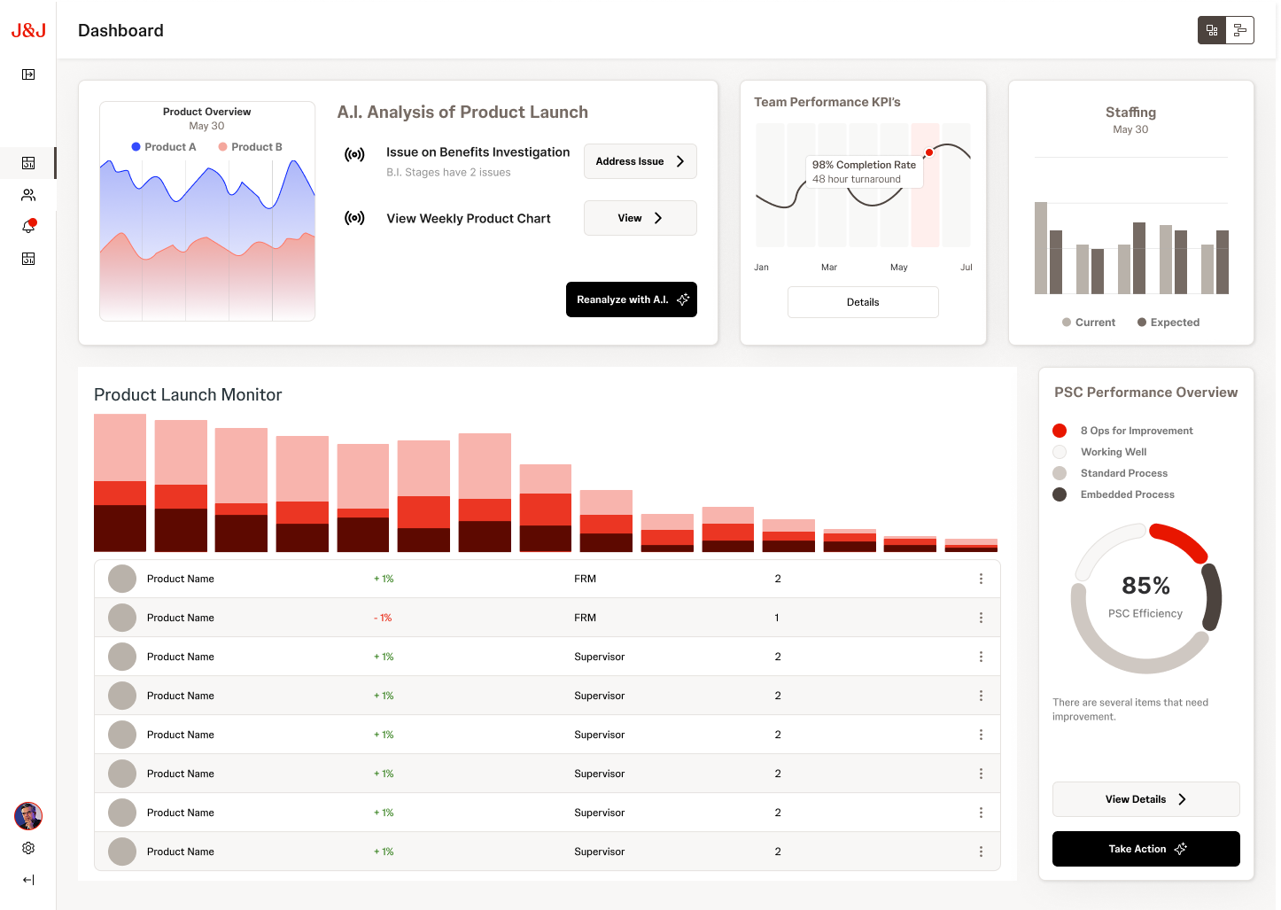
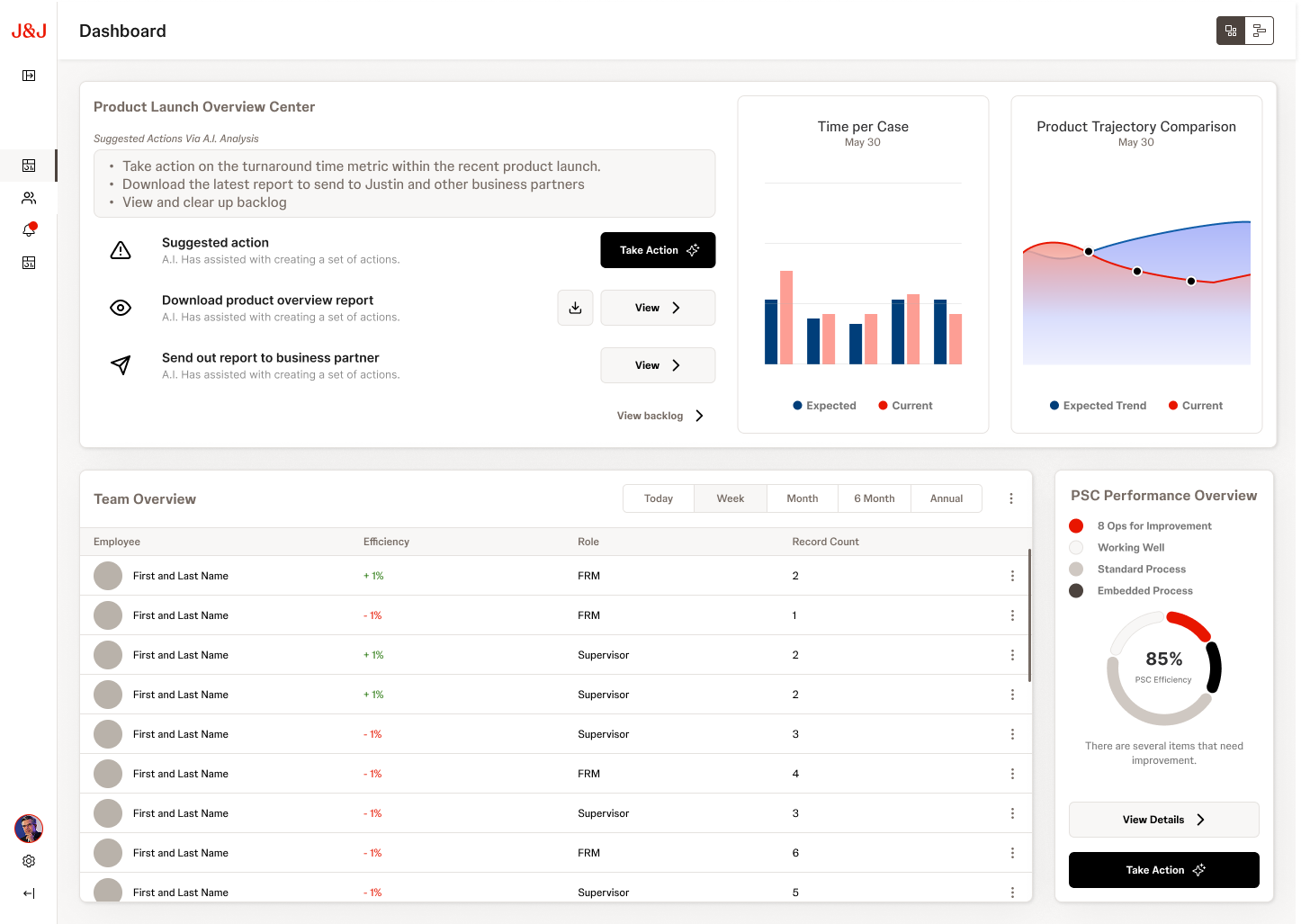
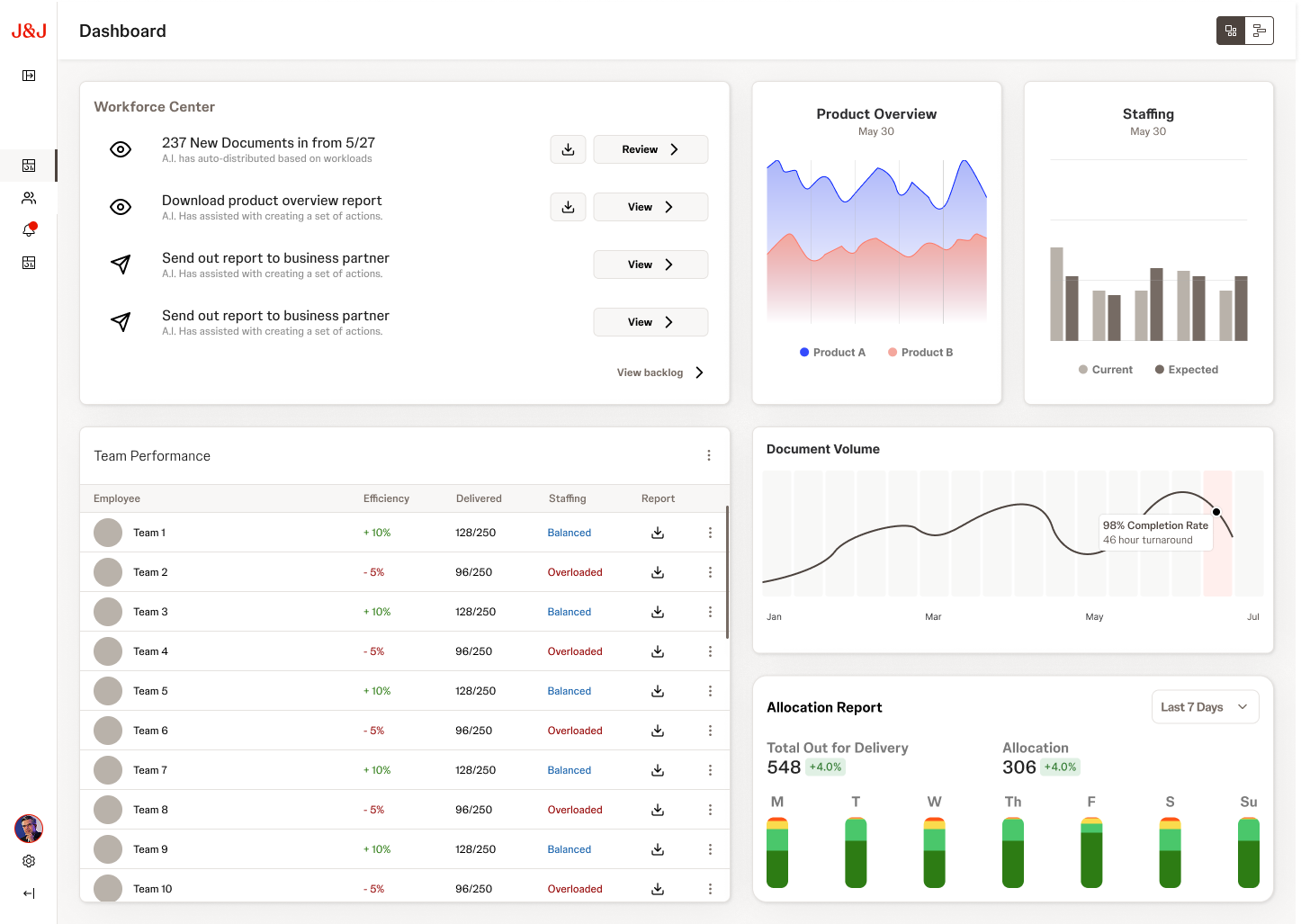
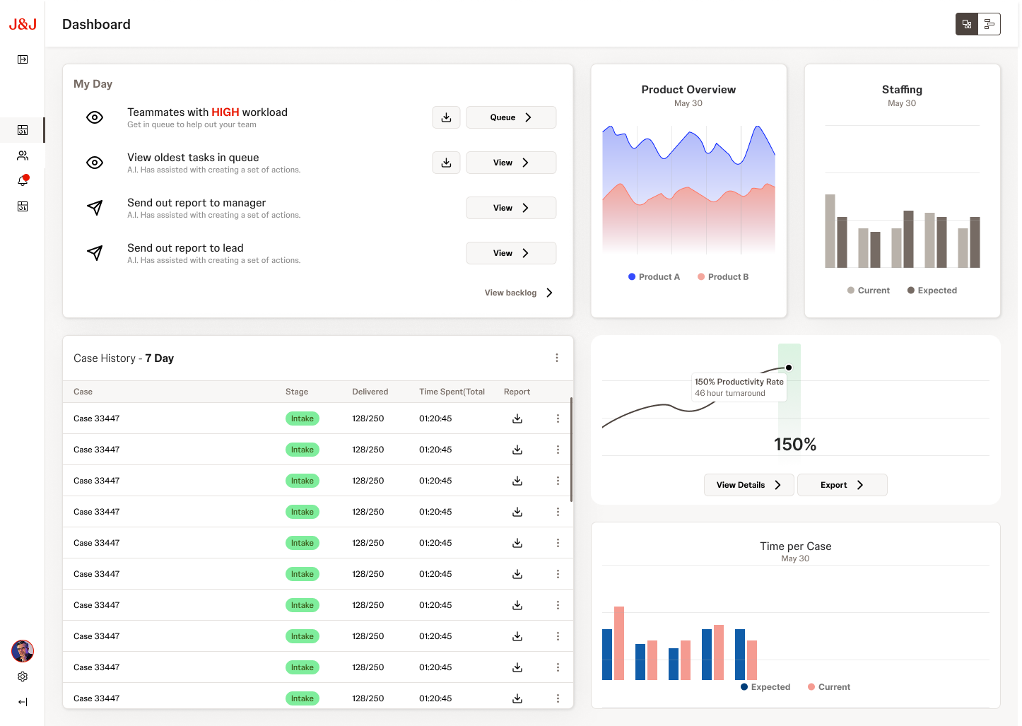
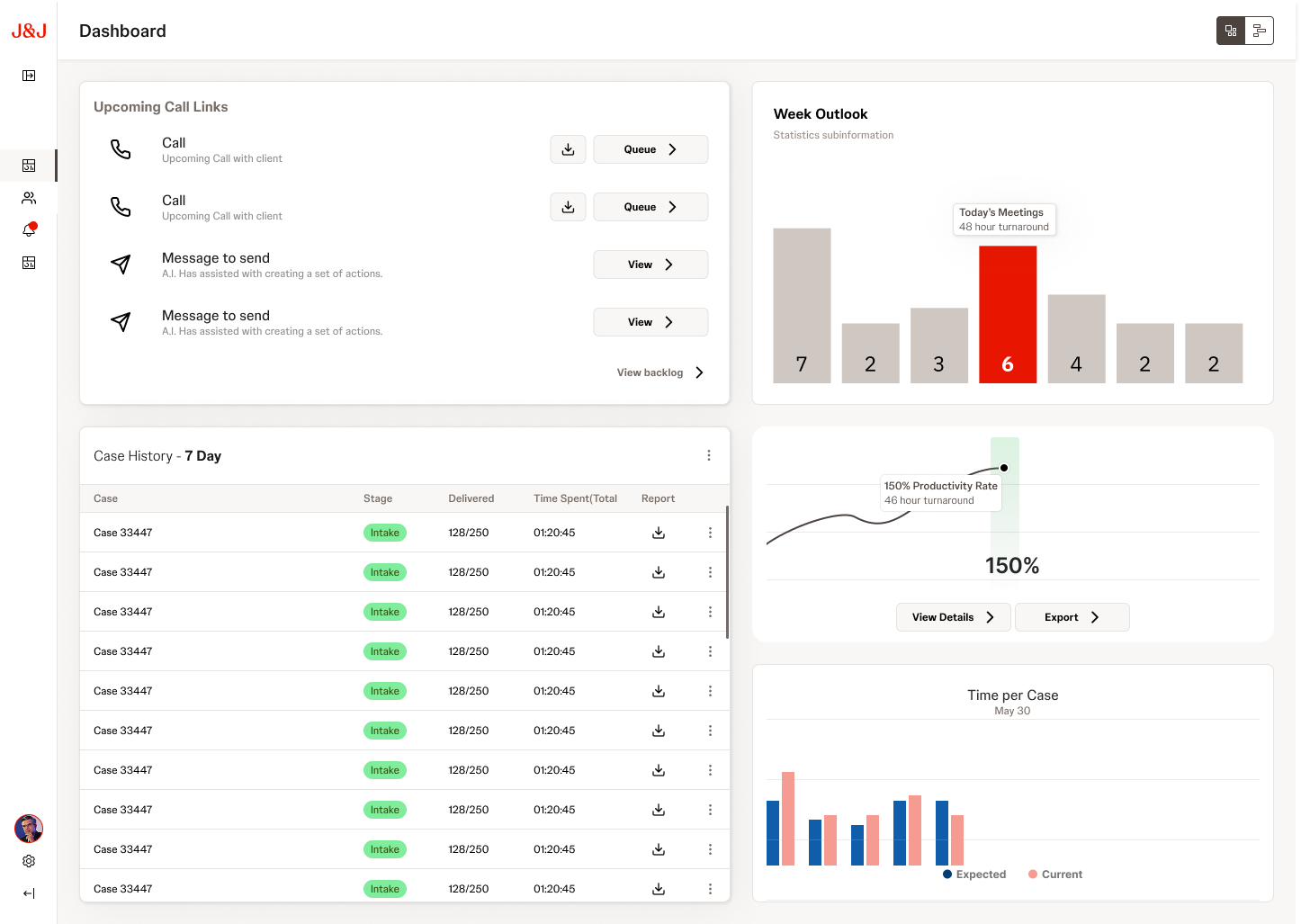
The Command Center design delivered a unified platform concept that gave J&J's Patient Services Center a clear path from disconnected spreadsheets to role-aware, real-time operational intelligence. The research-driven approach meant every module and interaction had a direct line back to a validated user need.

The Golden Thread methodology proved particularly effective: by walking stakeholders through realistic scenarios for each persona, we built alignment on what the platform should do before debating how it should look. The Pain Point Tracker became a living artifact that the client continued to reference well after the engagement.

5
Persona-specific dashboards
4
Top pain point themes resolved
85%
Target PSC efficiency score
Next project
Charcoal Design System